
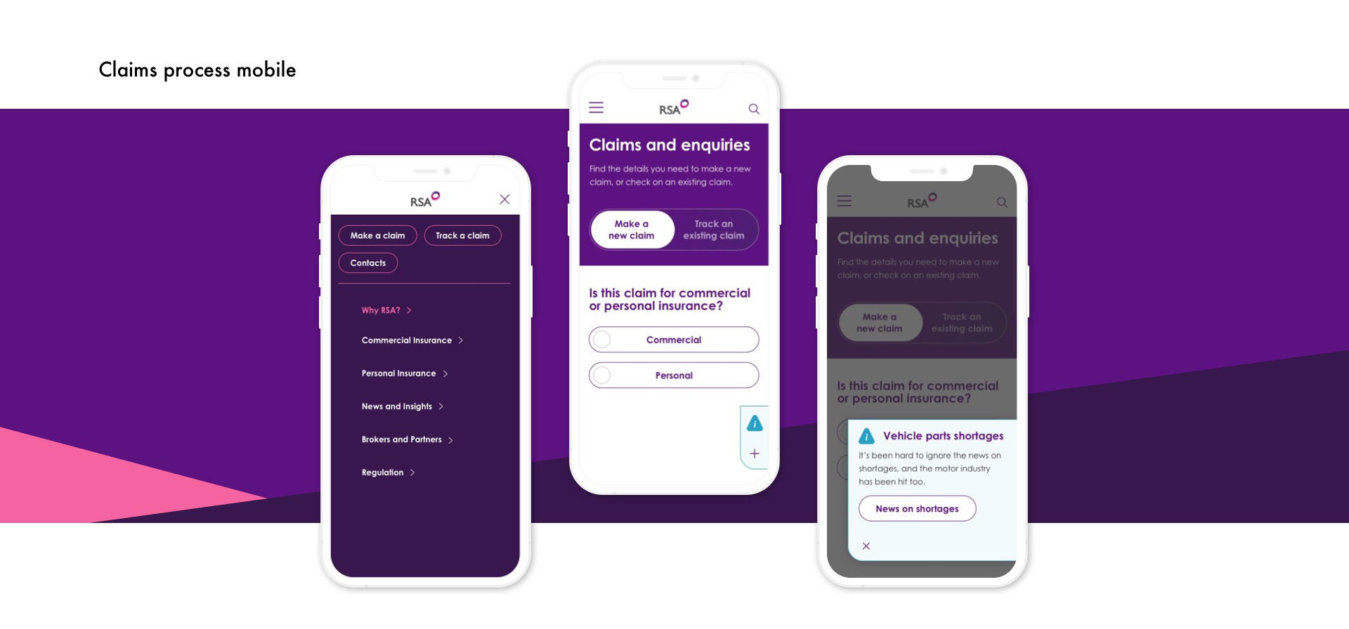
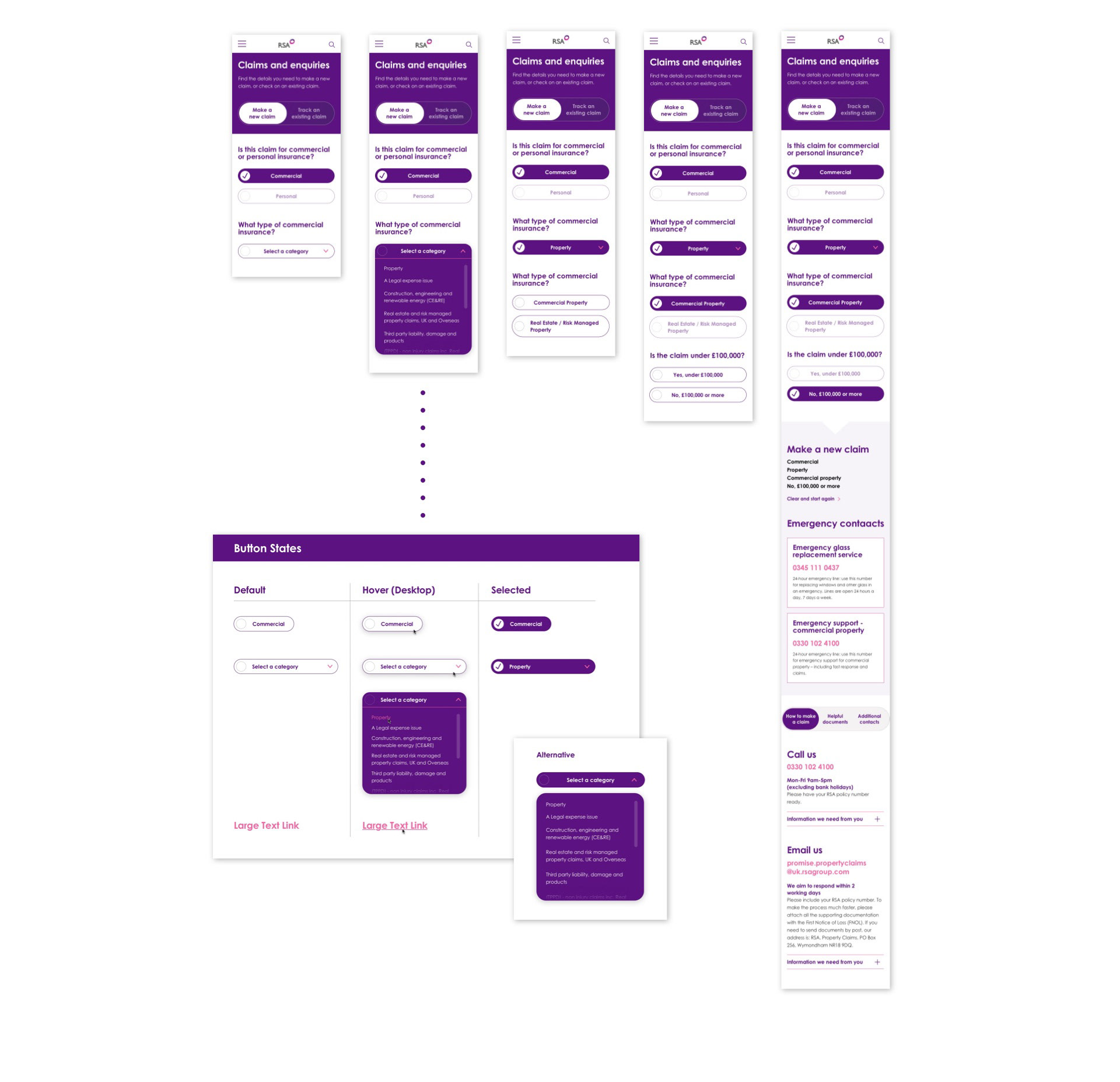
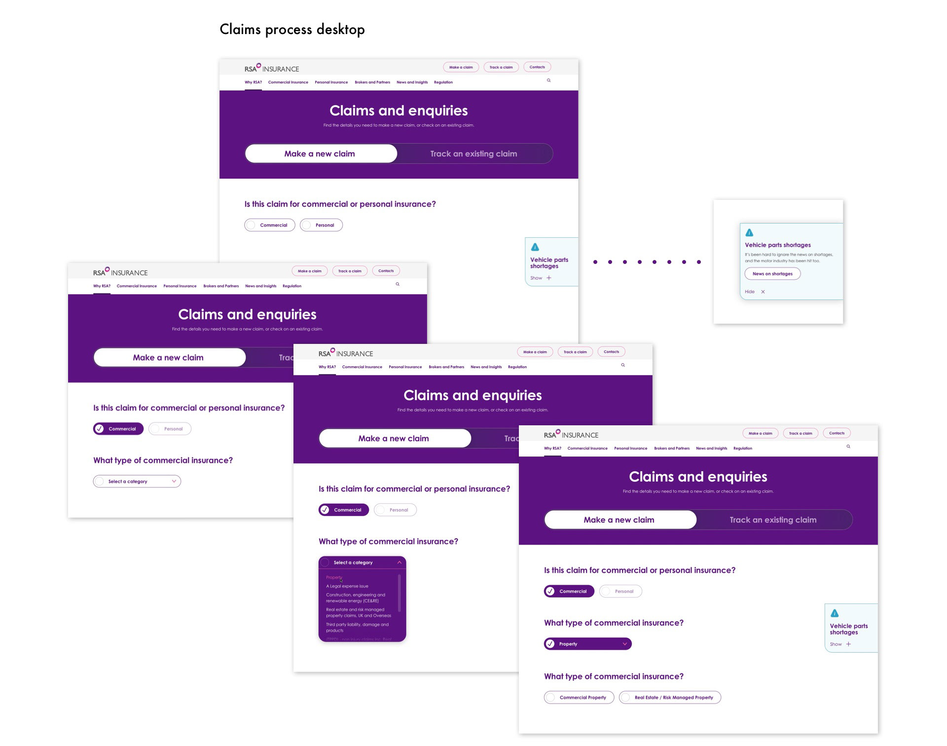
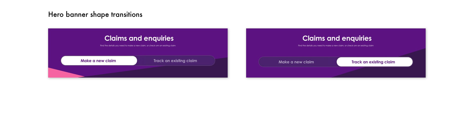
Prominent purple buttons with tick icons established much stronger visual feedback for the user on their current selections, and reduced user interaction to one click from two clear options, as opposed to the previous dropdowns for every question, which required two clicks for every selection. New claims and existing claims were both made accessible from one page with a simple button slider to select.
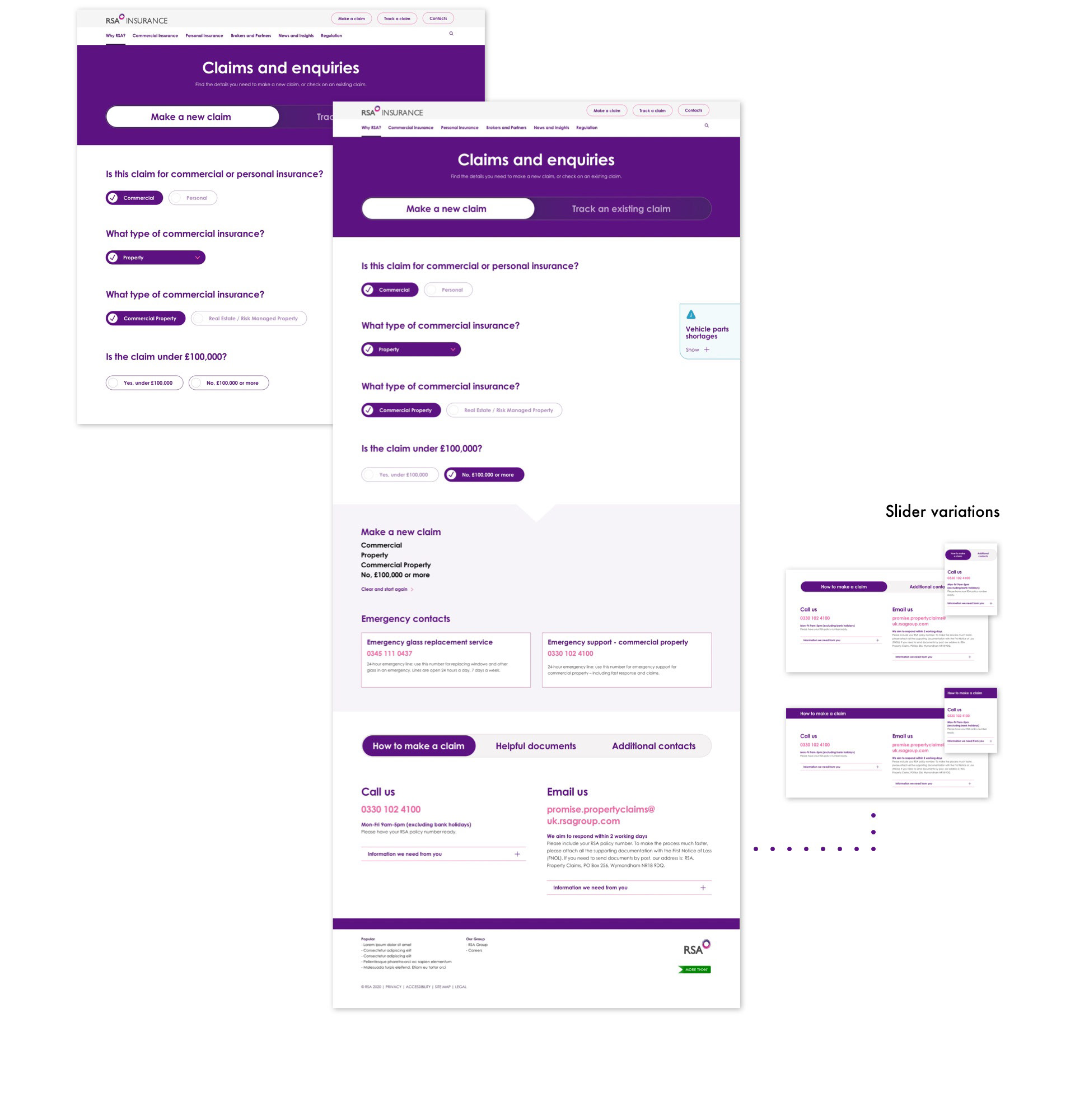

One and two column responsive results modules were created, taking elements from the existing design system and reworking text hierarchy. All permutations were accounted for and the largest copy strings and content sections were mocked up from data documents to assist development and reduce ambiguity.